Gadgets and Gizmos
Samsung s7 edge


Samsung released its flagship phone the Galaxy S7 edge back in early March of 2016 to resounding applause and praise. Now almost ten months later, let us take a look back at why the phone was such a huge success, and why it still can compete with the best end of the year smartphones. The s7 edge is the second design iteration to the s6 edge, which is the process of repeating a basic set of designs until a specific design outcome is met ( Lidwell et al, 2015). With its beautiful Quad HD 5.5 inch curved display, Samsung has created one of the most aesthetically pleasing looking devices to date. Let us now focus our attention on that gorgeous display.
Display
The theory form follows function, in which the function of a product should always be considered before aesthetics, almost doesn’t seem to apply to the S7 Edge. Samsung clearly focused just as much attention to the design as they did to their TouchWiz touch user interface, which detects a person's touch on the screen ( Preece et al, 2015) The 5.5 inch screen is curved on both sides and has a lot of functionality, it is not just a gimmick. The curves of the screen allow for edge panels, which when enabled allow users to swipe from the sides of the device to access weather information, frequent contacts, music player, and plethora of more options, which you can customize to your liking. With the Quad HD display, the battery does tend to drain a little faster than I would like, but that is the price you pay for the gorgeous display. However there are some Flexibility trade offs when you focus more on the flexibility of design and you have to compromises other aspects of said design (Lidwell et al, 2015). The biggest issue with the curved edges is that there are no side bezels, it looks stunning but if the phone is dropped there is a higher chance of the screen cracking. Another minor gripe with the edges is that sometimes when holding the phone, you will just randomly open an app when you had no intention of doing so, because of the shape of the phone your almost always touching the screen even if you don’t want to. Lastly with the Quad HD display, the battery does tend to drain a little faster than I would like, but that is the price you pay for the gorgeous screen. These are the only issues I have with the phone, now let us talk about the button placements.
Buttons
On the front of the device is a clickable home button that also functions as a fingerprint scanner. There are backlit keys on both sides of the home button, which provide haptic feedback by vibrating when pressed ( Preece et al, 2015). These allow users to access the recent apps and going back option. The power button and the volume keys are placed on the sides of the device and follow natural mapping in which the controls parallel the movement (Lidwell et al, 2015).
Customization
One of the biggest advantages of having an android device over an iPhone is the ability to have Control, in which users have input and control on how to customize and make your phone truly look unique ( Lidwell et al, 2015). However having all that control can increase the cognitive performance load of a user, in which there is so much mental effort used to learn and memorize all the aspects of the phone ( Lidwell et al, 2015). Users can customize their home screens by adding widgets, which allows you to display certain apps like weather right on the home screen, changing the look and size of their icons, to completely changing their app launcher from TouchWiz, to any other launcher. Since getting my phone about two months ago, I have spent countless hours customizing my phone to make it look exactly how I want it to look. I feel so much pride and a sense of an Ikea effect, in which the value of object increases because I created it, every time someone compliments me on the way my home screen looks.
Conclusion
With its beautiful curved 5.5 inch display, very smooth user interface, and a plethora customization options, I would absolutely recommend The Samsung Galaxy S7 Edge to anyone looking to upgrade to a newer device, even though its eight months old and has older hardware than some of its new competitor
Amazon Echo


In 2015, Amazon released Echo. The Echo is designed as a home base for other Amazon devices and services all by using your voice. While Amazon has created a unique and awesome device, the device does have a few minor flaws including the constant internet connection the device requires.
Directed Dialogue-
Directed Dialogue is when you ask a specific question, that question will have a specific response (Fox,2016).
I love the echo's speech interface, not only is it convenient, but it understands what I'm saying unlike other speech interfaces (Siri). The dialogue is direct, for example, If I ask what the weather will be like today or tomorrow, the echo will respond with the weather. It works the same way for if ask it what are the traffic conditions going from one place to another. The nice thing about the echo is that It only gives you that one response and it doesn’t ask you any follow up questions.
The Internet of things (Lesson 1)-
The Internet of things (Lesson 1) says that just because you can connect it to the internet doesn't mean you should(Fox,2016
The echo can act as a home base for other Amazon products. If it’s made by Amazon and if it can connect to the internet there is a very good chance you can use the echo to control, the device. Personally, I think this needs to change. I wish this could control other objects in a different way, but not the internet. This is the only major issue I have with this product. I am not a fan of this being connected to the internet and can control other devices. I wish that there was another way to connect these devices together without the internet. In a world, full of hackers, if someone hacks this they could hack your whole house. Luckily for me my internet sucks at times and the echo disconnects each time my Wi-Fi goes on the fritz.
Computational Offloading-
Computational Offloading is when you are using a device to complete a certain task in a easier and faster way (Fox,2016)
If you like to shop on amazon the echo was made for you. The computational offloading for this device works in two ways...
-
Say you have items already in your cart on amazon’s website, using the echo you can tell the echo to order what is in your cart for you. The echo will then order the items for you based on the information provided in your amazon account. Then it will confirm to you that items have been ordered.
-
You can ask echo how much a certain item is on amazon and then you can say “add to cart”. Then you can check out either via the echo, website or app.
In the end, the echo can do the work for with shopping on amazon. However, be careful I would honestly say that the first option is your best option. Only because if you buy a used item on amazon you don’t know what condition it is. Other than that, this function of the echo is very helpful.
Contour Bias-
Contour Bias is how the shape of an object can affect how we feel about the product (Fox,2016)
I will say that the Amazon Echo does look nice. The fact that the echo is in the shape of a cylinder helps it look more appealing. If the echo has any points or sharp edges I would recommend a redesign for it immediately. The only issue I have with it would if it wasn’t as tall I think it would look even better.
Otherwise, Amazon won with the design of how the product looks.
Cognitive Dissonance-
Cognitive Dissonance is when an individual will seek consistency between what they expect to happen and what will actually happen(Fox.2016)
For people who are worried about being hacked or believe the internet is going to destroy all of us. Then this product will be an immediate turn off. I think amazon should be concerned about if people understood what comes with these devices being connected and the risk factor that comes with it.
The Nintendo 64 was the premier gaming console of the mid-90s. Light weight, portable, and simple. Nintendo outdid themselves with this one. Released in North America in 1996 this cartridge console is the epitome of Norman’s fundamental argument (Nintendo.com, 2016).
The Console Design
The Nintendo 64 has four distinct features to it: the reset button, power switch, cartridge input, and controller ports. Norman’s argument suggests that just by looking at the console a user knows exactly how to use it without consulting the operating manual (Fox, 2016). The button, switch, cartridge input, and controller ports are clearly visible with their functions being clear and apparent (Lidwell, Holden, & Butler, 2015). The genius that is the Nintendo 64 console lies within its simplistic design. Every user that looks at the console can understand the design and operate it accordingly (Lidwell, Holden, & Butler, 2015). On the back of the console, there are two ports as well; one is for the power cord and the other is for the audio/picture cord. There are no “mystery” ports or features on the device and all of the features are essential. Moreover the popularity of this console exemplifies Ockham’s razor in that the simplicity of the console design is preferred (Lidwell, Holden, & Butler, 2015). I would almost describe the design as minimalistic. The signal to noise ratio is very high in favor of the signal. The design has no apparent irrelevant task information to distract users or take up space or mental processing power (Lidwell, Holden, &Butler, 2015).
Cartridge Input
The main feature that allows the Nintendo 64 to actually be a gaming console is the cartridge input where users put a game pack into the slot and it is ready to be played. All of the games shown on screen have high legibility with large text, bright colors, and flashing text to prompt actions from the user (Lidwell, Holden, & Butler, 2015). The one downside I to the cartridge slot is that it collects dust fairly easily and so users have to clear out the dust for the game to function properly. From my experience this needs to be done at least once a day. A possible improvement I would suggest would have been some sort of cover over the slot to keep dust out better.
Controller Ports
On the front of the console there are four controller ports which nudges people to be social with their gaming and play with up to three more friends (Fox, 2016). It not only nudges users to play games socially on the console, but it appeals to Bartle’s “socializer” gamer type. The sense of belonging that people get from sharing experiences with one another is extremely important and the four controller ports allow for these shared experiences to take place (Fox, 2016).
Concluding Remarks
I would highly recommend this product to any and all gamer types looking for a different console. The simplicity and functionality of this design are incredible. The only flaw that it has with the dust problem is only a minor inconvenience and a small price to pay for this product. Moreover I have owned this product since its release in 1996 and it is still functioning without issue twenty years later. I cannot say enough good things about this product. If the product was not discontinued I would urge you all to go out and buy it, but sadly it is no longer in production. I am hoping for another iteration though at this point it is most likely not feasible.


Nintendo 64
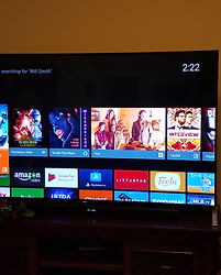
The Sony Bravia X90C released in early 2015 is one the thinnest most aesthetically pleasing looking 65 inch 4K TV's I have ever laid eyes on. I remember after setting it up in my living room and wondering how Sony created a TV that was thinner than my Galaxy S7 Edge. However I believe Sony paid too much attention to the design and hardware of the TV and not enough on the user interface and menu system. Let's revisit this ultra thin TV and discuss why it could have and should have been so much better.
Design
The moment you lay eyes on the X90C you can't help but be memorized by the screen and how thin it is. Looking at it from the side angle you almost can't tell it is a TV, only the bottom gives it away. A white LED light turns on at the bottom of the screen that provides visual feedback, which gives back information to let us know that the screen is on and working (Preece et al, 2015). When the TV is on the colors are very bright and crisp, and the viewing angles are great. Except for a few shows on Netflix and some movies available for purchase there is just not that much 4K content. However with this type of design there are some flexibility trade off, where Sony focused so much attention on the design that other aspects of the design had to be become more complex and compromised (Lidwell et al, 2015). To accomplish the very thin look, all the electrical parts at the back are at the bottom, making it very bottom heavy and unstable even with a stand. As someone who has cats, I get very nervous when they get behind it. Barely grazing the entertainment center makes the TV wobble, your better off just mounting it on a wall. Another trade off is the sound, it is good but leave much to be desired, you almost have to use a sound bar. If you don’t own a sound bar, than those are additional cost you will have to think about on top of the $2000 dollars your spending on the TV. Now that we have discussed the hardware let's discuss the interface a little and mainly the terrible menu system.
Interface
The TV's interface isn't anything unique or special, it looks like any other smart TV would, were it differs is in how you access it from the remote. On the remote if you press the home button it takes you to the smart TV hub, where all your applications are located, like Netflix and YouTube. If you press the home button, you are essentially changing the channel on your TV, it takes you to a completely different screen. However if your press the discover button instead of home, a screen overlay appears at the bottom, showcasing your most frequently used applications, as well what you have recently looked up in that application. For example it shows my list of movies and TV shows I recently queued on Netflix. There have been couple of instances when I have opened up too many applications and the TV has rebooted without giving any form of confirmation, which is used for preventing errors by having users verify their actions (Lidwell et al, 2015). The interface is not very complicated and is easy to learn and remember, where Sony fails is in the terrible menu system and the way it is organized.
Menu
The design of the drop down Interface Menu, which is a organized way of showing people options they might have( Preece et al, 2015), is the worst aspect of the TV. When you first open up the menu system, you get options for display and sound, TV, Twitter, twin pictures, menu and the media controls, then all these options have their own subcategories. The main problem with the menu system is that there is too much signal to noise ratio, so much of the information in the menu system is irrelevant and distracts from the relevant information (Lidwell et al, 2015). For example there is menu option for the menu where you can select options like top of the menu, home and power, which when pressed do nothing. There is a watch TV option in the menu and when pressed it takes you to the inputs, why not just label it inputs. The twin picture option when selected does nothing, and also the subcategory for the twin pictures option is twin pictures, why have a sub category if your going to name it the same thing. Sony needs to do an update for the menu system to follow KISS, which means to have a more simple design which works better and is more reliable (Lidwell et all, 2015). Make everything more organized by following the five hat racks rules, which is a metaphor that talks about the five ways to organize information by categorizing everything into related options (Lidwell et al, 2015). Chunking units of related information together will make it easier to understand and remember (Lidwell et al, 2015). There are too many redundant options that can be removed from the menu to make it more simple and easy to use. Remove the watch TV, twin pictures, picture off and media control options since they are already present on the remote. I would then chunk the 3D, and wide mode into Picture adjustments option. Then I would chunk Speakers, TV speakers, and headphone volume into the speakers option. Just making these simple chance makes the menu system more simple and less cluttered.
Conclusion
The Sony Bravia X90C, with its super slick and ultra thin design is one of the most beautiful TV's I have ever seen. However it is let down by its subpar menu system and lack of 4K content on the market. If your in the market for a TV and want a 4K one, then there are plenty of other options available that are going to be cheaper and still have similar picture quality.


Sony Bravia X90C
Texas Instruments released the TI-nspire cx handheld calculator in February of 2011. Along with simple math functions, the TI-nspire cx can perform mathematical evaluations of lists and spreadsheets, graph equations, summarize and analyze data. However, with all this calculator can do it has its flaws.
Design
The TI-nspire cx ‘s design is lightweight, thin and easily portable. Like most other calculators, the user will find numbered buttons in between an array of math functions in the center half of the product. This results in positive visibility: function is apparent and can be easily recalled(Fox, 2016). The lower third portion of the calculator contains an alphabetically organized set of buttons displaying the full English alphabet from left to right. Texas Instruments incorporated these keys so the user could potentially take notes or write messages on their calculator. However, because the buttons are set up in an untraditional keyboard format it is harder to type out longer sentences and fully take notes. This attributes to unwanted higher kinematic performance load: Physical effort required to accomplish a goal (Fox, 2016). In addition to having a keyboard that is hard to type on, the alphabet keys take up way to much space for the little function they offer, leading to an unwanted signal to noise ratio: how much task relevant info vs. irrelevant info, irrelevant info is distracting/take up space and mental processing power (Fox, 2016). The overall design of the TI-nspire cx is proficient because it fulfills the needs of students and teachers alike by being small and sleek but also has bad aesthetics and wasted space.
Interface
The TI-nspire cx has a unique interface that is unlike most other calculators. This is because the TI-nspire cx has extraordinary graphing and statistical capabilities, all displayed in color. The interface is also easy to use and navigate making it possible for users to get to and perform the task they want with ease. This is good because it requires to user to only use a small cognitive performance load: Mental effort required to accomplish a goal (Lidwell, Holden & Butler, 2015). Along with a small cognitive performance load, this calculator, like all calculators helps with external cognition and assisting in smooth computational offloading: using a tool or device to carry out a process for you(Fox, 2016). By using the TI-nspire cx, one can solve mathematical problems faster than they could if they were doing them in their head or by hand. But what happens when the user makes a mistake by pressing the wrong button or accidently deleting a document. Thankfully, the TI-nspire cx also has good confirmation: A technique for preventing errors by requiring certification before actions are performed. (Preece, Rogers, & Sharp, 2015). The TI-nspire cx performs beautifully when used, allowing the user to complete mathematically and other statistical functions with little effort.
Conclusion
Even though this calculator has its issues I would still recommend it to any student or teacher who would need to calculate more than just basic math functions. The TI-nspire cx has overall good design and a very user-friendly interface. I would recommend the high school or college student spend the money because it is worth the investment.


TI-nspire cx
The MacBook Pro is one of the most successful products that Apple has ever created. Used by teachers, professionals and all types of students the MacBook Pro allows for the user to perform infinite tasks across a vast variety of platforms. The MacBook Pro is overall a great product because of its design and user interface.
Design
When first experiencing the 13 inch MacBook Pro, the user sees a laptop computer unique in style and appearance. Starting with the overall pleasing shape, the MacBook Pro has an appealing contour bias: A tendency to favor objects with contours over objects with sharp angles or points (Lidwell, Holden & Butler, 2015). This product is also appealing because of its simplicity of keyboard placement and single trackpad that acts as the unit mouse. This idea fulfills Ockham’s Razor: Simple designs should be preferred and proficient designers favor simplicity over ornamentation (Fox, 2015). In addition, because the design looks better the majority of people think that it performs better too. This process is known as aesthetic usability effect: if a product is more attractive then it will work better (Fox, 2016).
Finally, MacBook Pro user’s can tell if their computer is off or in sleep mode when the device is closed by looking at its breathing status LED indicator, located on the front bottom right edge of the computer. Without opening the MacBook Pro its user can look to see if it’s “breathing” and if it is, the user will know that it is in sleep mode and can be used. This function illustrates the idea of anthropomorphism: a preference for things that appear humanlike or exhibit humanlike characteristics (Lidwell, Holden & Butler, 2015). Overall, the discrete design of the MacBook Pro is what sets its apart from its competitors, while also not being too flashy.
User Interface
Apple products are known for their superior but simplistic user interfaces. Adults, teenagers, and kids can all use the MacBook Pro with ease and efficiency because of its easily navigational interface. At first, the MacBook Pro can seem intimidating and daunting to the novice user but apple made it simple by using modularity: managing system complexity by dividing large systems into smaller self-contained systems. Modularity is just like going to the grocery store and looking for food products by aisle. If the user or grocery shopper were to look for what they wanted in a system with no organization or structure they would get lost and take forever to find what they needed. In addition to modularity, the MacBook Pro uses the five-hat rack organizational system, Alphabetical: refers to the organization by alphabetical sequence (Fox, 2016). For example, when the user pulls up any folder or file window the contents of that location are stored in alphabetical order making for faster findings. Lastly, the MacBook Pro uses iconic representation: The use of pictorial images to improve recognition and recall (Preece, Rogers, & Sharp, 2015). By doing this, users can quickly navigate through apps by recognizing the application in relation to its actual functions. For example, the Email application icon is a postage stamp, because the image of a stamp is directly related to sending things physically through the mail. Apple's success partially does come from their easily operated and navigational user interface because, without it, the MacBook Pro wouldn’t be the same.
Conclusion
In total, if I were to recommend a laptop computer to anyone who is looking to purchase one, I would without a doubt recommend the MacBook Pro. Its user interface and overall design is unparalleled in the market for consumer computers. It's small enough to take anywhere and simple enough to be used by anyone. There is no reason why someone who is looking for a personal computer should overlook the MacBook Pro because it’s the best there is.


MacBook Pro
Overall, I would recommend this product to any one who uses any of Amazons services. However,please keep in mind their is a potential security risk that comes with it. Please use caution!!